Have you ever asked yourself, why blue is king in global branding or why the red colour drew you to the ad and pushed the click button?
And
Did you realize that one can get over 20% more conversions due to the color of just one button?
An important role of most popular colors is in the creation of user experience and creation of decisions. Colors do not just perform a cosmetic work; they summon emotions, promote motivations and draw actions of users. Colors preference is a decision in business as important in the board room as it is in convincing a customer to press the buy-now button.
Introduction
Even the smallest details count in the design world layout, typography, anything and everything it adds to the user experience and the brand on the surface is an element to be considered. However, the psychological effect of color is overlooked although it can be very strong. It forms feelings, makes choices, and creates messages without uttering even one word. Psychology of color would allow the designers to produce more effective, interesting and efficient experiences.
Colors determine the behavior of the users in the digital spaces- yellow colors turbocharge the user creating the feeling of energy and the feel of blue colors relax the user and gain their trust. The current blog discusses the basics of color psychology and how it can be used in digital design to empower user interaction, brand recognition, and success in general.
What is Color Theory?
The science of color is called the color theory that answers the way colors interact in order to produce a visual and meaning effect. In the essence, it is a basis in making design intuitive, appealing and functional.
Primary Colors: Red, blue and yellow- the foundation of other colors.
Secondary Colors: Green, orange and violet are created by mixing two primaries.
Tertiary Colors: Are brought about by combination of a primary color and a next-door secondary.
The base of these combinations is well thought palettes that mean mood, meaning as well as message.
The basis involves primary colors, red, blue, and yellow. Together they make secondary colours which are; green, orange and violet. Tertiary colors can be created by mixing a major color with a nearby secondary color. Although more depth can be applied to the classification thereof, the majority of work concerning design is based on these fundamental groups.
Color theories Behind
Color-in-Context Theory
Depending on the context, colors have different meanings. The color red might be a sign of love in one place and the danger in the other.
Conceptual Metaphor Theory
The theory implies that cultural metaphors influence the meaning of colors, e.g. a glimpse of red is angry, a feeling of blue is sad: an example of language and culture.
What does Color Psychology mean?
Color psychology refers to the study that examines the effect of color on people and their behavior. It discusses the idea that certain hues create a certain response, which means hue is one of the potent designing items to shape perception and interaction.
Major Uses of the Color Psychology in Design
Conjuring up Emotional ties
Colors are able to provoke various emotions. Red, orange and yellow tones Tend to be somewhat faithful to the context of energy, enthusiasm and warmth, which can all relate to excitement, when necessary, or urgency or even optimism. Subsequently in comparison there are cool colors, yes blue, green, and purple, all associated with calm, stable, and trusting which are soothing and assuring. Designers can apply these hues in the background, text, and imagery in a strategic manner to elicit certain portions of emotions among people who view a work of art.
Branding and Identity of most popular colors
The aspect of color is basic in creation and strengthening of brand identity. Colors used by brands convey their values and convey their message letting them have a visual constancy that can be easily noticed in logos, web pages, package designs and advertisements.
Visual Hierarchy
Without color, it would be impossible to direct the attention of the user and create a visual priority. Contrasting or bright color makes it easier to focus on some essential things, like headlines, buttons, or calls to action, so it enhances user experience and navigation process.
Regional and Cultures Sensitivity
The meaning of colors may be quite different in different cultures and regions. As an example, in one culture, white is a sign of purity but in another one, it can denote mourning. Unless it is working in a multicultural or global environment, designers should take notice of such differences as these will enable them to create culturally appropriate and respectful designs.
Improving the Usage and Accessibility
Color is an important aspect in digital design as it makes interface easy to use and accessible. Color combinations can be high-contrast and show more readability and significance. Designers also should mention color vision deficiency, including color blindness, providing universal color schemes and accessibility features.
Aesthetic Appeal
Harmony of colors helps in enhancing designs in general. Wise combinations of balanced and selected color pallets form a desirable visual impression which can be relatable with the target audience.
User Engagement
The choice and placement of colors is strategic to ensure one gets the attention and invites interaction. As an example, CTA (Call-to-Action) buttons may be painted in bright colors or hover effects can use slight variations of colors that enhance the interactivity and engagement of users.
Psychological Influence
Coloration may cause a direct effect on the user behavior and the user choice. There are a variety of ways in which marketers use color psychology to influence behavior to take specific actions, i.e., the use of colors that may prompt people to make purchases or take specific actions to better the conversion rates.
The Mood and Atmosphere
Hues assist to define the mood of an artwork. Red or orange as warm shades can make a sense of excitement, decrease of urgency, blue and green as cooler colors can make a feel calm and peaceful thus making a contribution to atmosphere in general.
Testing and Optimization
To pick effective colors usually needs experimenting. A/B testing and user feedback are popular improvements used in design where designers can test color pairings and make data-driven decisions and adjustments to enhance relationships with color to create a higher impact visual appeal and usability.
Why should color in UI/UX matter?
- Guidance Navigation: Colors such as red, yellow automatically attract centralization of attention to the CTAs.
- Sets Tone Blue: Feels professional; green: feels active.
- Promotes Brand: Repeating use creates an allusion in the mind of the user.
Tips to Designers
- Make colors consistent with the brand voice and audience.
- Employ 3-4 main colors to be united.
- A/B testing will allow testing the minor changes previously mentioned.
- Give opportunity of scheme feedback to them with the aid of users.
- Be flexible, the theory of color is no set of rules.
- Color Picking tools
- Coolors.co: instant creation of palettes
Adobe Color Wheel: Using complementary color Aside from being familiar to the user, there are other reasons why I find myself drawn to the Adobe Color Wheel when I have to select complementary colors. I find myself going to the Adobe Color Wheel to select complementary colors because it is easy to use and well-known to the user. Apart from these two reasons, there is one more explanation to why I use Adobe Color Wheel to select complementary colors.
Material Color Tool: User friendly recommendations
Conversions Clicks: The Business of Color
Mood is not the only effect of color but it determines the behavior.
As an example, during an even more popular experiment conducted by HubSpot, a red CTA button (compared to a green one) performed better by 21 percent, contrary to expectations.
There is no single color that works the best, but experimenting with a color scheme depending on the behaviour of your audience is a must regarding the maximum number of conversions.
It is not a gender-based preference of colors.
Research indicates that men like loud contrasting colors whereas women are more comfortable with softer, shading colors. Remarkably, blue is a universal favorite among all the genders and cultures.
The popularity of Blue
The world tends to like blue because it is easy to relax and trust. Common in the natural world, as well as the byword of stability, it is popular in branding, particularly in the fields of technology, healthcare, and finance.
Interesting Facts:
Surely looked conservative, but fruitful.
- Office decor is typical to increase concentration.
- In food it is rare–a frequent appetite inhibitor.
- typically connected with melancholy in art and in language (“blue mood”).
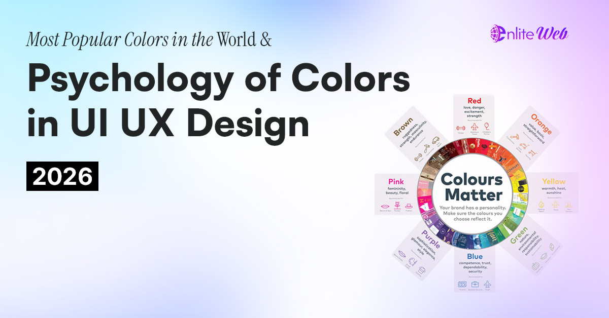
- Psychology of color and its application to UI Design Red
- Attached Emotions: Passion, love, excitement, energy, urgency
- UI Application: UI Application is one of the most popular and used applications in a call-to-action button and a warning message, as people react to it immediately.
Orange
Other Emotions Attached: Creativity, excitement, Welcomingness, brightness
UI Application: brings about a playful and energetic nature to interfaces. Commonly applied to aspects meant to offer some noticeably inspiring or waywaring motivations to users.
Green
Attributive feelings: Growth, health, nature, phlegm
Application UI: Very common in designs with a wellness, environmentally friendly, or finance theme to create an impression of being at balance and having rebirth.
Yellow
Compendium of Related Emotions: Gladness, optimism, heat, caution
UI Application: This is best used to attract attention or to give a light-hearted feel, so it must be applied rarely because too much of it can lead to visual exhaustion.
Blue
Connected Emotions: Believing, calm, reliability, composure
UI application: common in the field of technology and finances to create a sense of trust, professionalism, and security.
Purple
Subsidiary Affects: Regiety, frilly stuff, piety, mysticism
User interface application: It is suitable in branding a high-end or a premium product. Exudes excellence and class.
Pink
Co correlated Emotions: Playful, romantic, young, sweet
UI Application: This can be employed in the products targeting the younger generation or producing the soft feminine visual effect.
Black
related Emotions: Elegance, sophistication, power, mystery
UI Application: Often applied by very expensive brands to assure exclusivity and smoothness. It brings in sophistication and contemporary designs.
White
Connected emotions: Purity, cleanliness and simplicity, peace
UI Application: The basic element of minimalist and modern interface, providing simplicity, roominess and content orientation.
Brown
Linked Emotions: Down-to-earth, comfortable, solid, classic
UI Application: Application is appropriate to natural, organic or rustic themes. Conjures competency and steadfastness.
Gray
Corresponding Emotions: Impartiality, equilibrium, correctness, functionality
UI: This is the application of a UI color on an app. This is typically used as a secondary or background color in order to enforce a hierarchy as it still presents a neutral professional look.
Gold
Related Emotions: Affluence, richness, status, and success
UI Application: Gives a feeling of grandeur and elitism that can be utilized in premium branding or parties.
The Effect of Color in Branding
The use of color is influential, and it determines how an individual acquires the perception of a brand. Color is more complicated than beauty: it can enhance brand identification, convey the values of a brand, and distinguish it among others. One of the best examples out there is Tiffany & Co., where the signature robin egg blue box comes to mind immediately. It is more than a packaging because it conveys a sense of luxury, elegance and exclusivity of the brand.
The selection of the color palette is part of strategy. It ought to communicate the personality of a brand well, appeal to the audience and create the desired sentiments. Small children use colors to communicate; what color could send a message to adults as well? The intensity of red with its passion and energy, the trustworthiness of blue and its calmness, and many others. The various colors used by any brand have to be carefully selected in order that it may have an effective identity which will stand the test of time.
Examples of Success Brand Color usage In the Real World
Coca-Cola
The red color of Coca-Cola is famous. The bright color is associated with the electric power of energy, passion, and excitement, which allows keeping the brand always in the memory and recognizable at once. It has the effect of arousing a feeling of being joyful and refreshed these are fundamental emotions that are shared by the brand.
Apple
Apple communicates simplicity, innovation and sophistication through the use of minimalistic color schemes based mostly on white and gray color. This pure background supports the progressive, trendy image of any brand and improves the minimal design of the goods and interface.
Starbucks
The green color that the Starbucks brand exhibits signifies freshness, growth, and sustainability. It is related to the brand concept of ethically sourced coffee and offers the customers a welcome place of relaxation throughout the world.
Netflix
The bright red that is being used by Netflix draws eyes and makes the viewers feel excited and in a hurry. The color reflects the vibrancy of the content provided to the user and this color has been strongly associated with the personality and the brand as a leader of digital entertainment.
The deep blue of Facebook expresses trust, security, and communication, which are elements that are needed in social networking sites. The blue color also helps Facebook in its goal of connecting people and keeps customers secure and relaxed as they communicate.
Amazon
The orange-yellow color of the Amazon logo coupled with the arrow Z-A denote going forward, efficiency and diversity. It shows how the brand is devoted to innovation and customer satisfaction which is an image of flawless shopping experience.
Airbnb
In 2014, Airbnb changed its visual identity to a new coral shade dubbed as Rausch. This was a lively and warm color in order to attract feelings of being at home, exploration, and belongingness which are the fundamental values of the Airbnb experience. The originality of the color used made the brand stand out and solidified the brand as a rather inclusive and community-focused company.
Spotify
Spotify takes a unique green color that connotes growth, imagination, and burgeons. The color is visible in the technical and musical arena, enhancing the brand image of Spotify that is young, innovative, and strives to create audio connections between people.
2. Contrast Making Clarity and Focus
Or have you ever abandoned reading a web-site or a sign that was difficult to read? This is normally due to lack of contrast. Contrast provides insignia, isolates and refers the attention, which can be achieved by color, size, shape or texture.
A good contrast enhances the readability, as well as attracting the attention to important details. As an example, it is easier to read words on a black background and a large and contrasting button on a muted background would naturally get attention.
Appearances are overrated-this is one area where contrast makes interfaces more visible, more easily understood and more interesting to use.
Color and Gender Preshapes
Are men and women colorblind? Although this is not conclusive, there are some tendencies as acquired via research.
Men also are interested in bright, daring colours with a big contrast. The women usually prefer more smoky tones. Both have a preferred liking to blue and green though purple is more acceptable by women and not so much to the men.
Being aware of such preferences can make you shape your design preferences more towards the audience.
Final Thoughts
You see, color is not only the fashion; it is the plan. It may direct behavior, elicit emotional responses and influence decisions. The psychology and the world preference of color knowledge assists a designer and a company in creating a color-connected and conversion drive experience.
Are you willing to do something revolutionary with your UI/UX? Call one of the professional design agencies who can provide you with science behind every shade.