Typography is important in determining the way users engage with digital products. It could be a web page, smartphone application or software interface but text is likely to be the most frequent item on which users interact. Typography is more than a font. What we have to do is to create a clean, aesthetically-satisfying experience where information can be generally communicated.
This guide is going to deconstruct the concept of typography, its relation toward user interface/user experience design, and the main principles and tricks that can be used to develop outstanding digital experiences. You will also know how typography can enhance readability, emotional appeal and strong brand identity.
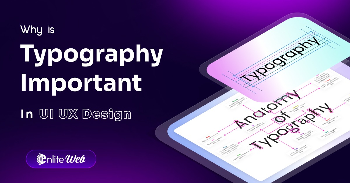
What is Typography?
Typography in its essence is an art of organizing text which is readable and interesting to the eye. It entails the selection of the styles of type, the size of fonts, spacing, alignment, color and the general patterns of written texts. Although most people mistake fonts and typefaces, the two are not identical. The general form of lettering is called a typeface and a particular weight or style within a typeface is called a font.
The digital design hasText style everywhere. The use of typography should be creative and functional on every part that entails text such as on the headlines, buttons, microcopy, and navigation menus.
Why Typography Matters in UI/UX Design
Text style has a greater effect in UI and UX than simply making the material look good. It acts as a guide to users so that they can grasp how information is structured, how information flows and which information is important. Well-done typography enhances the experience and provides more clarity.
In contrast, the inappropriate use of typography may lead to infuriated reading; however, the user refuses to read the text. Incompatible typography and design intent can go to the extent of making people less trustful of your product or brand. Acquiring a skill in typography, designers can make sure that their work is clear and influences on the emotional level.
The Core Elements of Typography
To achieve good typography there is a need to comprehend and apply the basics of typography. These are some of the most important parts:
Typefaces and Fonts
A typeface is a pattern of fonts that maintains a similar design. Typical ones are Arial, Times New Roman and Helvetica. There may be variation in font within a typeface by weight (e.g. bold, light), by style (italic, regular), by width (condensed, expanded).
Designers have five major font styles:
- Sans Serif: Clean, sober and pure. A little something special for display boards.
- Serif: Cowardly, elegant, formal, tradicional. Perfect for reading long-form.
- Script: amp; Cursive & Decorative. Commercial used for logos and headers.
- Monospace: Each character is given the same space. Used in code driven UIs.
- Display/Decorative: Fun and one of a kind, best in Headlines.
The selection of the typeface will rely on the tone, context and purpose of your content.
Vertical Space and Letter Spacing
The distance between lines of text is known as Line height (leading). Correct line height improves readability, particularly where there are small displays. Insufficient space cramps text, excessive space disjoints it.
Space between characters is addressed by letter spacing (tracking). Tight tracking is useful when the size is small. Text set in large type may be made more legible, and more elegant, by the introduction of space.
Text Alignment
There are options of left, right, central and justifying text. Left alignment is the most readable with regard to body content. The centered style is most apt whenever dealing with texts like a heading or brief phrases. Design should be structurally clear without any discrepancy to bring visual harmony.
Rank and Stress
Typography assists in defining a visual context that tells the customer what to read first. Headings are to be larger and bold than subheadings which will differ in regard to text. Hierarchy may also be achieved by use of color, weight, spacing and alignment.
Typography in Branding
The element of Text style is a great contribution to brand identity. The right font could render the personality, values and tone of a brand. As an example a law firm can use a classic serif font to demonstrate reliability and technicality, whereas a technology start-up may opt to use a modern sans-serif font to appear novel and advanced.
Branding is all about consistency. By applying the common Font design in the marketing materials, website and social, a sense of familiarity is established and recognition develops with time.
Such companies as Coca-Cola, Google, and Netflix are vivid examples of memorable and recognizable brands due partially to their regular typography.
User engagement and Typography
Typography is not only communicating content but it also influences user behavior. A good looking font encourages people to continue reading. Uncoordinated or messy typography may drive them away.
The font size, length of the line and spacing should be taken into consideration by the designers, so that they hold the interest of the user. As an example, research indicates that an optimal line length of readership lies at between 50-75 characters per collection. Appropriate typography also aids in lowering the bounce rates, dwelling time and conversion rates of landing pages.
Short History of Typography
Typography goes as far back as the 11th century but history was really formed when the printing machine was invented by Johannes Gutenberg in 15 th century. One of the first physical examples of mass-produced text is the Gutenberg Bible and has a type style which is called Textura by today.
Since the centuries, typography changed with age, and according to technologies: metal typesetting to new digital design tools. Text arrangement is actually a combination of art, science and psychology nowadays. The new capability to access web fonts and responsive design has introduced the ability of designers to apply dynamic and scalable Font designon devices.
5 Major Factors to Look at When Selecting Typography of UI
The choice of proper typography does not lie solely in the visual taste. These are the five important things to remember:
Crowd and Setting
Find out who your users are. An education game will require different fonts as a budgeting program.
Device Responsiveness
Typography has to change with screen size. Test the way it looks on mobile, tablet and desktop always.
Performance
High loading times are caused by custom fonts. When speed is important, use optimized web fonts or system defaults.
Font Pairing
When taking on a project, restrict the fonts to a minimum 2-3 fonts. One main font to be used on the heading and another one on the body should usually suffice.
Accessibility
Make your typography legible to all users including the visual impaired. Apply a high contrast, large enough and plain fonts.
Creating a Visual Hierarchy by Typography
The use of hierarchy in typography forms a guide of where the users are expected to go. With the flexibility of size, weight and spacing, designers get the eye flow through the titles to subheadings to body text.
As an example, the landing page could start with a 48px title, followed by sub heading 24px and a paragraph with a 16px font. The structure is easy to scan and follow the outline of information by the user through this pattern.
Hierarchy can also be emphasized using color and contrast. Nevertheless, one can use them with caution and restraint.
Feelings and Words
Typography is able to arouse the same emotion as an image or a color. The style and curves, weight and space of fonts provide an emotional sense of Font design.
Soft fonts that are rounded can express friendliness as well as comfort, whereas condensed fonts can be serious or urgent. When you know the psychology of fonts, it will be easier to make your design in line with the expectation and emotional requirements of user exploitation.
Questions that the designers ought to consider are: Will this typeface portray the message we are trying to present?
Typography Trends in 2025
The world of design is ever changing and Text arrangement is not an exception. Some of the bold trends manifesting in 2025 are:
- Extra large headlines which command notice
- Clean geometric-based sans-serif faces Minimal sans-serif fonts:
- Device- or screen-adapted variable font
- Animation of typography to provide personality
- Geometry tailed fonts that would help distinguish the brand name
Being up-to-date when it comes to typography will make your designs appear to be fresh and competitive.
Common Typography Mistakes to Avoid
Even the most experienced designers may commit typography errors. The following are some to avoid:
- Having an excessive number of fonts in one project
- Inadequate text to background contrast
- Aligning long paragraphs at a center
- Irrelevant size and space between fonts
- Not testing typography in mobile devices
Text arrangement is like decoration–such a style should not interfere. It should accompany and support the subject matter and the customer.
The Effect of Typography on Decision-Making
The role of typography is rather insidious yet influential in decision-making. Well designed Text style creates reliability where users will be inclined to rely on your content or brand.
One can determine the type influences on conversion with A/B testing of various types of Text arrangement used in headings or CTAs (call-to-actions). A font weight or color switch can affect any clicks of a user.
Typography And Color Schemes
Typography deals not only with letterforms and spacing but the effectiveness ofText style also rests on color. The text readability and visibility should be promoted by your color palette.
To be contrasting, use dark written words on light or white grounds (or the reverse) basis. Avoid color schemes that are straining or inaccessible by color blind users.
Text style and color combine to form mood, hierarchy, and readability.
Conclusion:
One of the first vital yet lightly outsiders to pay attention to in the UI/UX design process isText style. It is not only about choosing pretty fonts, it is about improving informative level, brand awareness, and facilitating user digital experiences.
As a matter of fact, most web sites and apps are more than 70 percent text based. Being able to Text style is being able to master the user experience. To practise the eye of the aspiring designer, real life applications, including a package to a web site are inventive.
Begin playing around with the typeface, line spacing, font combinations and hierarchy styles in your work. The intuitiveness of typography grows the more you train at it, hence the more successful your designs would be.